TYPOGRAPHY....What's That???
September 1, 2021
TYPOGRAPHY....What's That???
Since I was a very, small child I have always been fascinated with books. I could read Second Grade books when I was five years old and most books were great but really old books were flippin' AMAZING. Why? Because inside the books were these beautiful words that had gorgeous letters! Serifs and Sans Serifs...what the...what???
Some letters were in what I now think to be Times New Roman? Courier New? But other letters were what looked to me to be scripted by hand with fabulous flourishes and little notches (I'll be learning what those notches are actually called this semester). Then as I got a little older, I started to notice that there were words EVERYWHERE! Stop Signs and buildings, buses and awnings, and then I went to school....fuhggeddabouddit! And all of the feelings that I got from those letter designs were different. Can you imagine? The style of the letters made me feel some kind of way! Astounding!
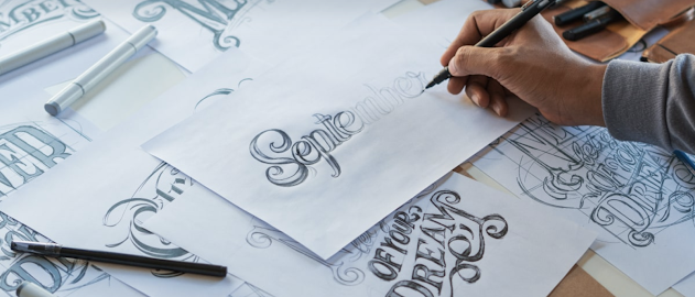
Sooooo...what is it? Typography. Typography is the style or appearance of text; the art of working with text. There are things called hierarchy, leading, tracking, and kerning that are involved in Typography and it might seem like a foreign subject but broken down it just means you can do sooooo much with just some basic knowledge.
In Typography, there are Serifs. Serifs are a Traditional type of font that have little strokes (sometimes called Little Feet) and are used mainly in Printed forms of publications.
and Sans Serifs (Sans is French for Without serif). Sans Serifs are used for a clean, casual, some say easier to read especially online.
Display fonts are decorative fonts that are also known as headline type, its purpose is to attract attention. Display type can also set the tone of a piece and is used in small quantities as to not overwhelm the subject matter.
When creating a piece it's best to use two or at most three fonts to keep it interesting. Mixing BOLD with light or TALL with short are great for holding focus.
Hierarchy leads the reader's eye to what is most important, it shows them where to start and what to see next.
Leading is the space between text also known as Line Spacing. Leading is used to make text most comfortable for the reader.
Tracking is the overall spacing between the words, condensing or expanding as needed.
And last but not least is Kerning. Kerning is the individual space between characters. As each letter is a different shape many times the Kerning needs to be adjusted to help them fit better together.
Within Typography there are Typefaces. Typefaces are essentially the leader in a family with the rest of the family in different weights and italics being fonts.
Now you know the basic foundation of Typography. Of course there is so much more you can learn but with this information and over 200,000 different styles of fonts you are ready to create some amazing stuff!


Comments
Post a Comment